【Kotlin/Android】MaterialButtonToggleGroupの使い方!トグルボタンの実装方法

この記事からわかること
- Kotlin/Android StudioでMaterialButtonToggleGroupを実装する方法
- セグメント型のトグルボタンの使い方とは?
- 選択状態にする方法
- 背景色を変更にするには?
index
[open]
\ アプリをリリースしました /


環境
- Android Studio:Flamingo
- Kotlin:1.8.20
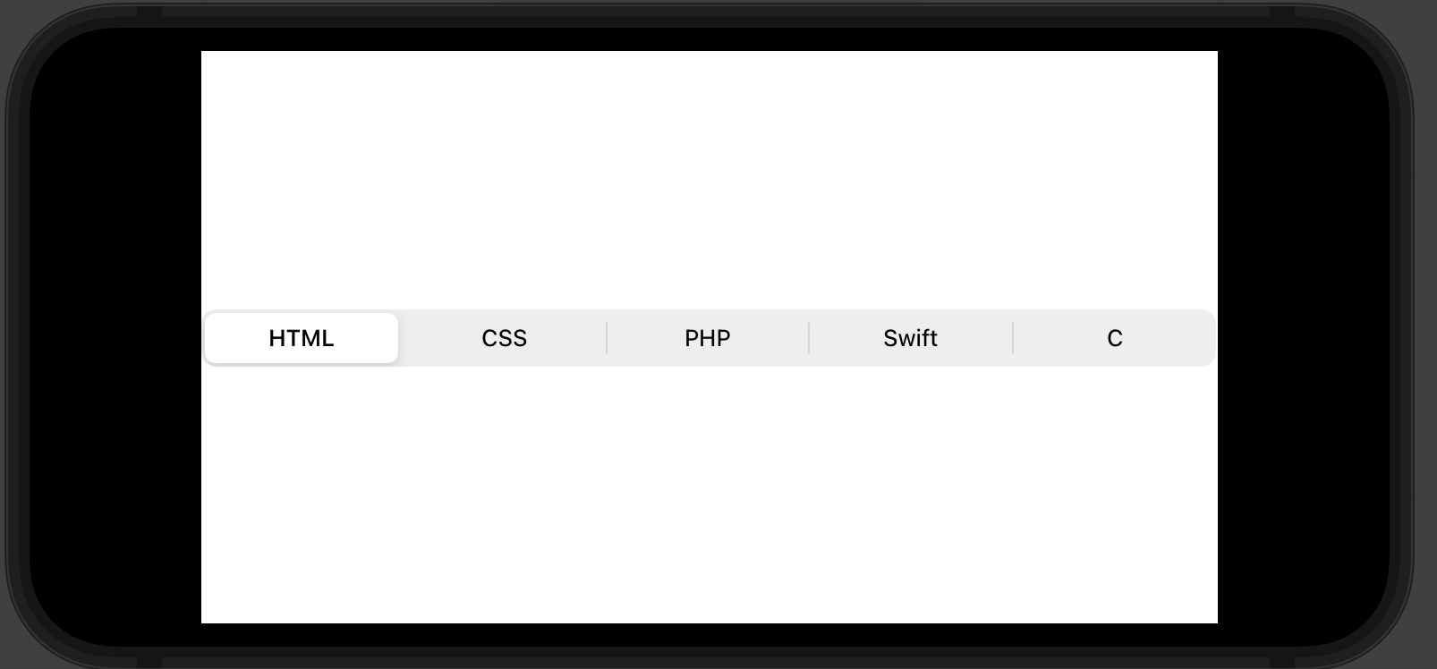
SwiftのSegmentedPickerStyleのようなボタンの実装方法
Android/KotlinでSwiftのPickerのSegmentedPickerStyleのようなUIを実装したくなりました。
SwiftのSegmentedPickerStyle
おすすめ記事:【Swift UI】Pickerの書式と使い方とスタイル変更!配列や列挙型
これを簡単に実装する方法としてマテリアルデザインのMaterialButtonToggleGroupを使用することで実装することができました。
マテリアルデザインのMaterialButtonToggleGroup
MaterialButtonToggleGroupの使い方
マテリアルデザインを使用する流れ
- マテリアルデザインの導入
- テーマをマテリアルにする
- MaterialButtonToggleGroupを実装する
マテリアルデザインの導入
まずはマテリアルデザインを使用できるように以下を「build.gradle(Module.app)」側に追加します。
// マテリアルデザイン
implementation 'com.google.android.material:material:1.5.0'
テーマをマテリアルにする
続いてプロジェクト内でマテリアルデザインが反映されるようにテーマのparent部分をマテリアルデザインのテーマに変更しておきます。ここはプロジェクトにあったマテリアルデザインの親テーマならどれでも良さそうです。このテーマを設定しておかないとうまく反映されずに何も表示されないようになってしまうので注意してください。
<style name="Base.Theme.MyApp" parent="Theme.Material3.Light.NoActionBar">
<!-- Customize your light theme here. -->
<item name="android:windowSplashScreenBackground" tools:targetApi="S">@color/ex_thema</item>
</style>
MaterialButtonToggleGroupを実装する
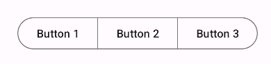
実際にトグルボタンを実装するにはMaterialButtonToggleGroupタグの中に?attr/materialButtonOutlinedStyleをstyleに指定したボタンを配置します。
<com.google.android.material.button.MaterialButtonToggleGroup
  android:id="@+id/toggleButton"
  android:layout_width="wrap_content"
  android:layout_height="wrap_content">

  <Button
      android:id="@+id/toggle_button1"
      style="?attr/materialButtonOutlinedStyle"
      android:layout_width="wrap_content"
      android:layout_height="wrap_content"
      android:text="Button 1" />

  <Button
      android:id="@+id/toggle_button2"
      style="?attr/materialButtonOutlinedStyle"
      android:layout_width="wrap_content"
      android:layout_height="wrap_content"
      android:text="Button 2" />

  <Button
      android:id="@+id/toggle_button3"
      style="?attr/materialButtonOutlinedStyle"
      android:layout_width="wrap_content"
      android:layout_height="wrap_content"
      android:text="Button 3" />
</com.google.android.material.button.MaterialButtonToggleGroup>
これだけで以下のようなUIのトグルボタンを実装することができます。
コードから選択状態にする
MaterialButtonToggleGroupではユーザーがタップしたボタンが選択状態となり背景色が変更されるような仕組みになっています。コードからあらかじめ任意のボタンを選択状態にするにはcheckメソッドを使用して引数に選択状態にしたいボタンのIDを渡します。
val toggleGroup: MaterialButtonToggleGroup = findViewById(R.id.toggleGroup)
val button1: MaterialButton = findViewById(R.id.toggle_button1) // 選択状態にするボタンのIDを取得
// ボタン1を選択状態にする
toggleGroup.check(firstButton.id)
ボタンの色を変更する
ボタンの選択状態の色を変更する方法が見つけられなかったのでbackgroundTintListとsetTextColorを使用して変更することで背景色を変更することができました。しかしcheck判定は意味をなくしてしまったので自分でタップされた時に色を切り替えるような処理にする必要がありました。
val tintSelectList = ContextCompat.getColorStateList(this.requireContext(), R.color.ex_text)
val textSelectColor = ContextCompat.getColor(this.requireContext(), R.color.white)

detailButton.backgroundTintList = tintSelectList
detailButton.setTextColor(textSelectColor)
まだまだ勉強中ですので間違っている点や至らぬ点がありましたら教えていただけると助かります。
ご覧いただきありがとうございました。